Analysing Helipad Data
- 19 minsWe have some data from the KSS HEMS patients conveyed to KCH.
#Read the data into a dataframe, specify the NA strings to incorporate the missing values
data <- read.csv("data/HEMSdata.csv", na.strings=c("NA","n/a", ""))
#Let's see how many cases there are
print(nrow(data))## [1] 569#Let's filter the data range to limit it to 01/01/14 to 31/12/14
#Load the required libraries
require(lubridate) #to work with dates
require(dplyr)
#Parse the dates into POSIXct format so that R can work with it
data$Date <- dmy(data$Date)
data <- filter(data, Date >=dmy("01/01/2014") & Date <=dmy("31/12/2014")) %>% #then sort by date
arrange(Date)
#Let's see how many cases there are now after applying the date range filter
print(nrow(data))## [1] 326Notice that the coordinates are in the Ordnance Survey Grid format under the column “Grid”. For us to work with this meaningfully, we need to convert this to latitude and longitude (WGS84) coordinates.
Fortunately there are others who have encountered the same problem before:
Sources:
* http://stackoverflow.com/questions/23017053/how-to-convert-uk-grid-reference-to-latitude-and-longitude-in-r
* https://stat.ethz.ch/pipermail/r-sig-geo/2010-November/010141.html
* http://www.hannahfry.co.uk/blog/2012/02/01/converting-british-national-grid-to-latitude-and-longitude-ii
* http://cran.r-project.org/web/packages/rnrfa/rnrfa.pdf
#Load the required packages
require(rnrfa)
require(dplyr)

#Remove the rows with missing vehicles
data <- filter(data, Vehicle!="select...")

#Remove the rows with missing Grid references
data <- filter(data, !is.na(Grid))

#Fix the rows with missing Counties, they all happen to be Kent
data1 <- data %>% filter(is.na(County)) %>% mutate(County = "Kent")
data2 <- data %>% filter(!is.na(County))
data <- bind_rows(data1, data2) %>% arrange(Date)
rm(data1)
rm(data2)

#Parse the OS Grid References into Eastings and Northings, then pipe it into WSG84 Coordinates
coordinates <- OSGParse(data$Grid) %>% OSG2LatLon()

#Add these onto the data
data <- mutate(data, lat = coordinates$Latitude, lon = coordinates$Longitude)

#Write to .csv
write.csv(data, file="data/cleaned.csv")
Let’s perform some descriptive stats
#Let's see what types of cases were brought KCH
count(data, Job.Type, sort=TRUE) %>% mutate(Percentage = n/sum(n) *100)
## Source: local data frame [8 x 3]
##
## Job.Type n Percentage
## (fctr) (int) (dbl)
## 1 RTC 153 47.2222222
## 2 Accidental injury 75 23.1481481
## 3 Assault 38 11.7283951
## 4 Sport/Leisure 19 5.8641975
## 5 Medical 15 4.6296296
## 6 Intentional self-harm 13 4.0123457
## 7 Other 8 2.4691358
## 8 Other transport 3 0.9259259#Let's see what way they were conveyed to KCH
count(data, Vehicle, sort=TRUE) %>% mutate(Percentage = n/sum(n) *100)## Source: local data frame [7 x 3]
##
## Vehicle n Percentage
## (fctr) (int) (dbl)
## 1 G-KAAT 101 31.172840
## 2 G-KSSA 94 29.012346
## 3 Volvo 86 26.543210
## 4 G-KSSH 17 5.246914
## 5 G-LNAA 16 4.938272
## 6 BMW 6 1.851852
## 7 Merc 4 1.234568We can now start making some maps!
Let’s first visualise the locations of each HEMS pickup as a quick visualisation
#Load the required libraries
require(ggplot2)
require(ggmap)
require(dplyr)
require(Cairo)

#Let's first visualise the locations of the London Major Trauma Centres
ukmap <- get_map(location = "London, UK", zoom = 10, scale = 4, color = "bw")

#Let's geocode the Trauma Centres in London (separately for those with and without helipads)
x <- geocode(c("The Royal London Hospital, London", "St. George's Hospital, Tooting, London"), source = "google")
y <- geocode(c("King's college Hospital, London", "St. Mary's Hospital, Paddington, London"), source = "google")

#Plot the map
ggmap(ukmap) +
  geom_point(data = x, aes(x = lon, y = lat), col = "light blue", fill = "blue", size = 4, shape = 21) +
  geom_point(data = y, aes(x = lon, y = lat), col = "pink", fill = "red", size = 4, shape = 21) +
  guides(fill=FALSE, alpha=FALSE, size=FALSE)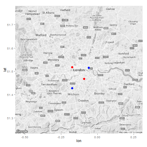
#ggsave("maps/Londonmap.png", type = "cairo-png")

#Get map from Google
ukmap <- get_map(location = "Kent, UK", zoom = 8, scale = 4, color = "bw")
ggmap(ukmap) +
  geom_point(data = data, aes(x = data$lon, y = data$lat, fill = "red", alpha = 0.95), col = "white", size = 3, shape = 21) +
  geom_point(data = x, aes(x = lon, y = lat), col = "light blue", fill = "blue", size = 3, shape = 21) +
  geom_point(data = y, aes(x = lon, y = lat), col = "pink", fill = "red", size = 3, shape = 21) +
  coord_map(projection="mercator", xlim=c(-0.72, 1.5), ylim=c(50.7, 51.6)) +
  guides(fill=FALSE, alpha=FALSE, size=FALSE)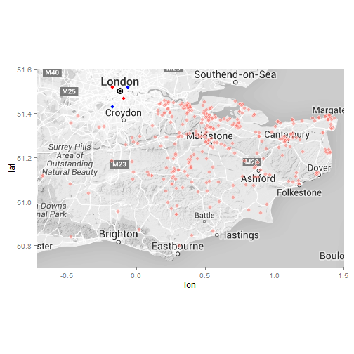
#ggsave("maps/KSSHemspoints.png", type = "cairo-png")

#Contour map
ggmap(ukmap) +
  geom_point(data = x, aes(x = lon, y = lat), col = "light blue", fill = "blue", size = 3, shape = 21) +
  geom_point(data = y, aes(x = lon, y = lat), col = "pink", fill = "red", size = 3, shape = 21) +
  stat_density2d(data = data, aes(x = lon, y = lat, fill = ..level.., alpha = 0.8) , size = 0.3, bins = 20, geom = "density2d", show_guide = FALSE, col = "red") +
  coord_map(projection="mercator", xlim=c(-0.72, 1.5), ylim=c(50.7, 51.6)) +
  theme(legend.position = "none")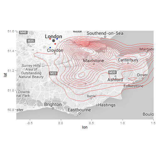
#ggsave("maps/KSSHemsheatmap.png", type = "cairo-png")

#Save the map
#ggsave("Cairomap.png", type = "cairo-png")

#We can separate the cases by the county where they come from, let's see the counties where they come from
county <- count(data, County, sort = TRUE) %>% mutate(Percentage = (n/sum(n) *100))
county
## Source: local data frame [4 x 3]
##
## County n Percentage
## (chr) (int) (dbl)
## 1 Kent 291 89.814815
## 2 East Sussex 14 4.320988
## 3 Surrey 13 4.012346
## 4 West Sussex 6 1.851852#Let's write this into a .csv file for QGIS to use
write.csv(county, "data/county.csv")
#Let's measure the distances between all the HEMS pickup sites and KCH
#We need the coordinates for KCH
KCH <- geocode("King's College Hospital, Denmark Hill, London SE5")## Warning in readLines(connect, warn = FALSE): InternetOpenUrl failed: 'A
## connection with the server could not be established'## Warning in geocode("King's College Hospital, Denmark Hill, London SE5"): geocoding failed for "King's College Hospital, Denmark Hill, London SE5".
## if accompanied by 500 Internal Server Error with using dsk, try google.#Let's load the required library to calculate distances
require(geosphere)
#We apply the VincentyEllipsoid method of calculating straight-line distance, and
coordinates <- data.frame("lon" = coordinates$Longitude, "lat" = coordinates$Latitude)
KCH <- data.frame("lon" = KCH$lon, "lat" = KCH$lat)
coordinates$distance <- distVincentyEllipsoid(p1 = coordinates, p2 = KCH) #This calculates distances in meters
#Lets add this distance to the master data frame, but convert it to kilometers first
data <- mutate(data, distance = coordinates$distance/1000)
summary(data$distance)## Min. 1st Qu. Median Mean 3rd Qu. Max. NA's
## NA NA NA NaN NA NA 324#Plot a histogram of the distances in ggplot2
ggplot(data, aes(distance)) +
geom_histogram(aes(y =..density..), binwidth = 10, col="black", fill="grey") +
stat_density(position="identity",geom="line", col="red") +
labs(title="Histogram of Distances conveyed") +
labs(x="Distance (km)", y="Relative Frequency") +
theme_classic()## Warning: Removed 324 rows containing non-finite values (stat_density).## Error in exists(name, envir = env, mode = mode): argument "env" is missing, with no default#ggsave("outputs/figures/HEMSdistances.png", width = 5 , height = 3, units = "in", type = "cairo-png")
#Plot a histogram of the distances
#hist(data$distance, breaks = 25, prob=TRUE, col="grey", xlab = "Distance of transfers (km)", ylab = "Relative Frequency", main = "Histogram of Transfer Distances with Kernel Density Curve")
#Overlay the kernel density plot of the distances
#lines(density(data$distance))We will create a new field for drawing lines between the Head and Tail sites on QGIS in a Well-Known-Text (WKT) LINESTRING format
#Text formatting for WKT LINESTRING
data$wkt <- paste0("LINESTRING(", data$lon, " ", data$lat, ",", KCH$lon, " ", KCH$lat, ")")

#Save the dataframe as a .csv
write.csv(data, file = "data/cleaned.csv")
write.csv(KCH, "data/KCH.csv")
We want to see whether there is a temporal relationship with HEMS cases, and whether there St George’s building their Helipad has had any effect on KCH’s workload.
#Load the required libraries
require(lubridate)
require(dplyr)

#We use the Lubridate package to manipulate the dates and time strings into POSIXct format so we can perform stats on them
timestamp <- paste(data$Date, " ", data$Time)

data$Day <- wday(data$Date, label = TRUE)

#Let's see if there is a difference between the cases depending of which day of the week they arrive
count(data, Day)
## Source: local data frame [7 x 2]
##
## Day n
## (fctr) (int)
## 1 Sun 58
## 2 Mon 39
## 3 Tues 44
## 4 Wed 43
## 5 Thurs 54
## 6 Fri 46
## 7 Sat 40#Let's see this in a graph
counts <- count(data, Day)
barplot(counts$n, main="Case Distribution over the Week",
xlab="Days of the Week", names.arg=counts$Day)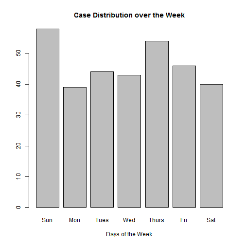
#Let's select the cases 6 months before St George's Helipad was constructed and 6 months after
data_before <- data %>% filter(Date >= dmy("01/10/2013") & Date < dmy("01/04/2014"))
data_after <- data %>% filter(Date >= dmy("01/04/2014") & Date < dmy("01/10/2014"))

count(data_before, County)
## Source: local data frame [4 x 2]
##
## County n
## (chr) (int)
## 1 East Sussex 2
## 2 Kent 73
## 3 Surrey 7
## 4 West Sussex 3count(data_after, County)## Source: local data frame [4 x 2]
##
## County n
## (chr) (int)
## 1 East Sussex 10
## 2 Kent 149
## 3 Surrey 4
## 4 West Sussex 3#Let's draw a time series of the cases, by monthly frequency
case_count <- count(data, Date)
case_count$Month <- as.Date(cut(case_count$Date, breaks = "month"))
monthly_count <- count(case_count, Month)
#Load ggplot2 to graph
require(ggplot2)
#Plot
ggplot(monthly_count, aes(Month, n)) +
geom_line() +
xlab("") +
ylab("Cases") +
ggtitle("Monthly Frequency of KSS HEMS Cases brought to KCH")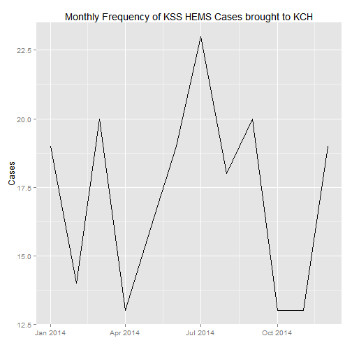
#Let's now draw a time series of the cases, by weekly frequency this time
case_count$Week <- as.Date(cut(case_count$Date, breaks = "week"))
weekly_count <- count(case_count, Week)

#Plot
ggplot(weekly_count, aes(Week, n)) +
    geom_line() +
    xlab("") +
    ylab("Cases") +
    ggtitle("Weekly Frequency of KSS HEMS Cases brought to KCH")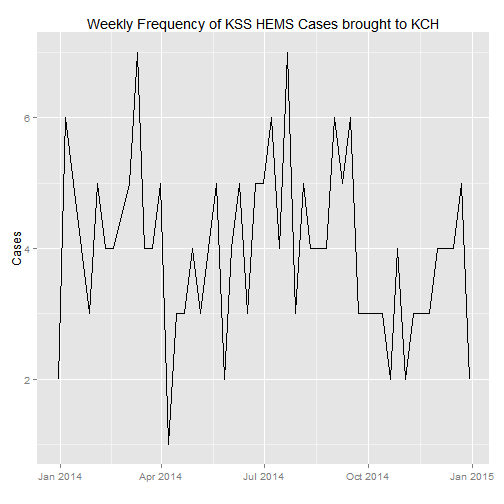

Danny Wong
Anaesthetist & Health Services Researcher