More mapping fun with ggplot2
- 15 minsI was recently tasked with creating a map for a friend to use in a paper. It contained a bunch of metrics from different institutions across a number of regions in the UK. As it often happens in situations like this, London tends to be a disproporionate outlier due to its density and concentration of stuff in relation to the rest of the country.
Therefore, we elected to plot an overall map for the whole country, and then zoom in to London more specifically and plot out London’s constituents separately so that it didn’t distort the rest of the country. I’ll show here what we did, using some random play data.
First we start by reading in the data:
#Load libraries and data
library(tidyverse)
library(ggplot2)
library(readxl) #to read in data
library(rgdal) #to read shapefiles

#Load the data for all cities
city_data <- read_excel("../data/City_data.xlsx", skip = 1)
colnames(city_data) <- c("City", "Metric_n", "Metric_x")

#Load coordinates for all cities
city_data_coords <- read.csv("../data/city_data_coords.csv") %>%
  filter((lon > -7 & lon < 1)) %>%
  select(City, lon, lat)

#Join coordinates to data
city_data <- city_data_coords %>%
  left_join(city_data, by = "City")
## Warning: Column `City` joining factor and character vector, coercing into
## character vector#Load London data separately
london_data <- read_excel("../data/City_london_data.xlsx", skip = 1)
colnames(london_data) <- c("Institution", "Metric_n", "Metric_x")
london_data <- london_data %>%
arrange(Metric_x)
#Join coordinates to London data
london_data_coords <- read.csv("../data/City_london_data_coords.csv")
london_data <- london_data %>%
left_join(london_data_coords, by = "Institution")## Warning: Column `Institution` joining character vector and factor, coercing
## into character vector#Load the map data for the UK
UK_map_data <- map_data("world", c("UK", "Isle of Man", "Isle of Wight", "Wales:Anglesey", "Ireland"))##
## Attaching package: 'maps'## The following object is masked from 'package:purrr':
##
## map#Load polygon data for London
london <- readOGR("../data/shapefiles/london.shp")## OGR data source with driver: ESRI Shapefile
## Source: "../data/shapefiles/london.shp", layer: "london"
## with 1 features
## It has 15 fields
## Integer64 fields read as strings: NUMBER NUMBER0 POLYGON_ID UNIT_IDNow we can start plotting a map. The first will include London data
map_1 <- ggplot() +
  geom_polygon(data = UK_map_data, aes(x = long, y = lat, group = group), colour = alpha("black", 1/4), fill = NA) +
  geom_polygon(data = london, aes(long, lat, group = group), fill = "grey", colour = alpha("grey", 1/4)) +
  #Add city points:
  #geom_point(data = city_data %>% filter(City == "London"), aes(x = lon, y = lat,
  #                                                              size = Metric_x), col = "green", alpha = 0) +
  #geom_point(data = city_data %>% filter(City != "London"), aes(x = lon, y = lat,
  #                                                              size = Metric_x, col = Metric_n), alpha = 0.8) +
  geom_point(data = city_data, aes(x = lon, y = lat, size = Metric_x, col = Metric_n), alpha = 0.8) +
  ggtitle("All of UK") +
  #Adjust the map projection
  coord_map("albers", lat0 = 49.84, lat1 = 60.85) +
  #Adjust the theme:
  theme_classic() +
  scale_colour_gradient2(low = "red", mid = "yellow", high = "green", midpoint = 20) +
  scale_size(range = c(1, 20)) +
  labs(size = "Metric (x)", col = "Metric (n)") +
  #scale_colour_brewer(palette = "RdYlGn") +
  theme(panel.border = element_blank(),
        axis.text = element_blank(),
        line = element_blank(),
        axis.title = element_blank(),
        plot.title = element_text(size = 20, face = "bold"),
        plot.subtitle = element_text(size = 12, face = "italic"),
        legend.title = element_text(size = 12),
        legend.text = element_text (size = 12),
        legend.position = "right")
## Regions defined for each Polygonsmap_1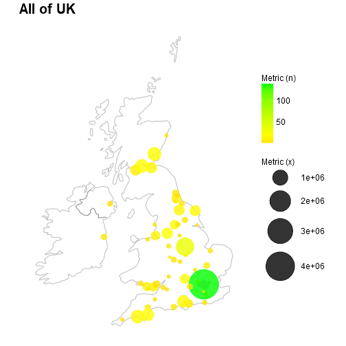
Notice how London completely distorts the scale? It would be far better to plot the rest of the country and then London separately in two different maps.
map_2 <- ggplot() +
  geom_polygon(data = UK_map_data, aes(x = long, y = lat, group = group), colour = alpha("black", 1/4), fill = NA) +
  geom_polygon(data = london, aes(long, lat, group = group), fill = "grey", colour = alpha("grey", 1/4)) +
  #Add city points:
  geom_point(data = city_data %>% filter(City == "London"), aes(x = lon, y = lat,
                                                                size = Metric_x), col = "green", alpha = 0) +
  geom_point(data = city_data %>% filter(City != "London"), aes(x = lon, y = lat,
                                                                size = Metric_x, col = Metric_n), alpha = 0.8) +
  ggtitle("UK minus London") +
  #Adjust the map projection
  coord_map("albers", lat0 = 49.84, lat1 = 60.85) +
  #Adjust the theme:
  theme_classic() +
  scale_colour_gradient2(low = "red", mid = "yellow", high = "green", midpoint = 20) +
  scale_size(range = c(1, 20)) +
  labs(size = "Metric (x)", col = "Metric (n)") +
  #scale_colour_brewer(palette = "RdYlGn") +
  theme(panel.border = element_blank(),
        axis.text = element_blank(),
        line = element_blank(),
        axis.title = element_blank(),
        plot.title = element_text(size = 20, face = "bold"),
        plot.subtitle = element_text(size = 12, face = "italic"),
        legend.title = element_text(size = 12),
        legend.text = element_text (size = 12),
        legend.position = "right")
## Regions defined for each Polygonsmap_2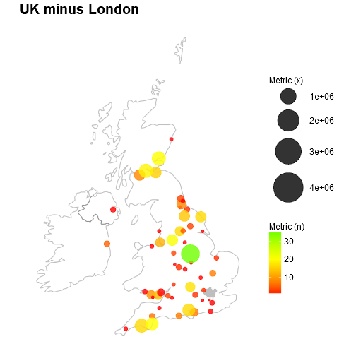
Now we can appreciate the scales outside of London. Notice I have replaced London with a little polygon of the City’s boundaries? We can now zoom into London on a separate plot. We will also list them out in a nice order to appreciate the rankings.
map_3 <- ggplot() +
  #geom_polygon(data = UK_map_data, aes(x = long, y = lat, group = group), colour = alpha("black", 1/4), fill = NA) +
  geom_polygon(data = london, aes(long, lat, group = group), fill = "grey", colour = alpha("grey", 1/4)) +
  #Add points:
  geom_point(data = london_data, aes(x = lon, y = lat, size = Metric_x, col = Metric_n), alpha = 0.6) +
  geom_point(data = london_data, aes(x = -1, y = c(49.5, 49.75, 50, 50.25, 50.5, 50.75, 51),
                                     size = Metric_x, col = Metric_n), alpha = 0.8) +
  geom_text(data = london_data, aes(x = -0.8, y = c(49.5, 49.75, 50, 50.25, 50.5, 50.75, 51),
                                    label = Institution), hjust = 0) +
  #Add a title:
  ggtitle("London") +
  #Adjust the map projection
  coord_map("albers", lat0 = 49.84, lat1 = 60.85) +
  #Adjust the theme:
  theme_classic() +
  scale_colour_gradient2(low = "red", mid = "yellow",
                         high = "green", midpoint = 20) +
  scale_size(range = c(1, 15)) +
  labs(size = "Metric (x)", col = "Metric (n)") +
  #scale_colour_brewer(palette = "RdYlBu") +
  theme(panel.border = element_blank(),
        axis.text = element_blank(),
        line = element_blank(),
        axis.title = element_blank(),
        plot.title = element_text(size = 20, face = "bold"),
        legend.title = element_text(size = 12),
        legend.text = element_text (size = 12),
        legend.position = "right")
## Regions defined for each Polygonsmap_3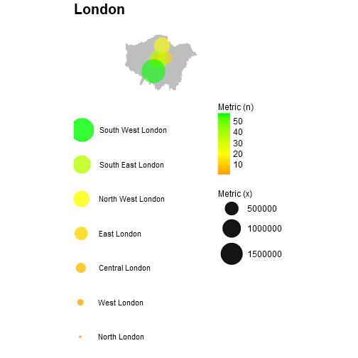
sessionInfo()## R version 3.4.2 (2017-09-28)
## Platform: x86_64-w64-mingw32/x64 (64-bit)
## Running under: Windows >= 8 x64 (build 9200)
##
## Matrix products: default
##
## locale:
## [1] LC_COLLATE=English_United Kingdom.1252
## [2] LC_CTYPE=English_United Kingdom.1252
## [3] LC_MONETARY=English_United Kingdom.1252
## [4] LC_NUMERIC=C
## [5] LC_TIME=English_United Kingdom.1252
##
## attached base packages:
## [1] stats graphics grDevices utils datasets methods base
##
## other attached packages:
## [1] maps_3.1.1 knitr_1.17 bindrcpp_0.2 rgdal_1.2-4
## [5] readxl_1.0.0 forcats_0.2.0 stringr_1.2.0 dplyr_0.7.4
## [9] purrr_0.2.4 readr_1.1.1 tidyr_0.7.2 tibble_1.3.4
## [13] ggplot2_2.2.1 tidyverse_1.2.1 sp_1.2-3
##
## loaded via a namespace (and not attached):
## [1] reshape2_1.4.3 haven_1.1.0 lattice_0.20-35 colorspace_1.2-6
## [5] yaml_2.1.14 rlang_0.1.4 foreign_0.8-66 glue_1.1.1
## [9] modelr_0.1.1 bindr_0.1 plyr_1.8.4 munsell_0.4.3
## [13] gtable_0.2.0 cellranger_1.1.0 rvest_0.3.2 mapproj_1.2-5
## [17] psych_1.6.9 evaluate_0.10.1 labeling_0.3 parallel_3.4.2
## [21] highr_0.6 broom_0.4.2 Rcpp_0.12.14 scales_0.5.0
## [25] jsonlite_1.5 mnormt_1.5-5 hms_0.3 digest_0.6.14
## [29] stringi_1.1.1 grid_3.4.2 cli_1.0.0 tools_3.4.2
## [33] magrittr_1.5 lazyeval_0.2.0 crayon_1.3.4 pkgconfig_2.0.1
## [37] xml2_1.1.1 lubridate_1.7.1 assertthat_0.1 httr_1.3.1
## [41] rstudioapi_0.7 R6_2.1.2 nlme_3.1-131 compiler_3.4.2
Danny Wong
Anaesthetist & Health Services Researcher