Visualising categorical data with jittered plots
- 2 minsWhen looking at data, sometimes we want to explore the relationship between categorical data (binary, discrete, ordinal, etc). For example in the mtcars dataset included within installations of r, there are data of the number of cylinders (cyl) and whether the cars are automatic (am = 0) or manual (am = 1).
head(mtcars)## mpg cyl disp hp drat wt qsec vs am gear carb
## Mazda RX4 21.0 6 160 110 3.90 2.620 16.46 0 1 4 4
## Mazda RX4 Wag 21.0 6 160 110 3.90 2.875 17.02 0 1 4 4
## Datsun 710 22.8 4 108 93 3.85 2.320 18.61 1 1 4 1
## Hornet 4 Drive 21.4 6 258 110 3.08 3.215 19.44 1 0 3 1
## Hornet Sportabout 18.7 8 360 175 3.15 3.440 17.02 0 0 3 2
## Valiant 18.1 6 225 105 2.76 3.460 20.22 1 0 3 1To look at the relationship between cyl and am, we could just do a table.
xtabs(~ am + cyl, data = mtcars)## cyl
## am 4 6 8
## 0 3 4 12
## 1 8 3 2But what might be easier to visualise would be to plot out the data.
plot(am ~ cyl, data = mtcars)
Notice that because the points all get plotted over one another, you don’t actually get to see the individual points. One way around this is to jitter the points.
plot(jitter(am) ~ jitter(cyl), data = mtcars)
We could even plot the points and add a trendline to help us see any relationships which we could then base our further exploratory analyses on.
scatter.smooth(jitter(mtcars$am) ~ jitter(mtcars$cyl),
               family = "gaussian", lpars = list(col = "red"))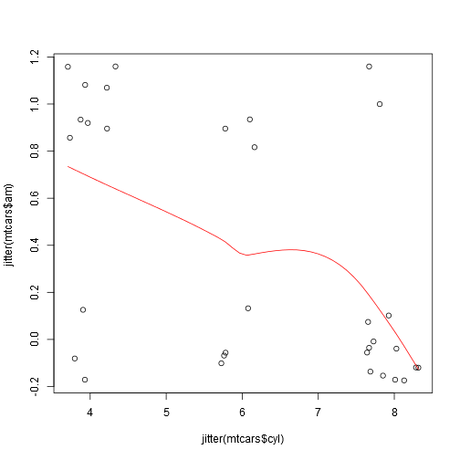

Danny Wong
Anaesthetist & Health Services Researcher